Compassion
Compassion is a platform where someone with means can donate directly to someone without means which they pass on the street. There is a growing base for social good most people don’t know where to start. The app is as fast and easy as pulling a dollar from your wallet.
I was part of a small team alongside with Unice Arce and Morgan Princiotta. My role was Team Lead, where I was responsible for research, front‑end development, and interaction design.
Problem to solve
How can we make donating an essential good to someone in need as simple as giving a dollar from your wallet?
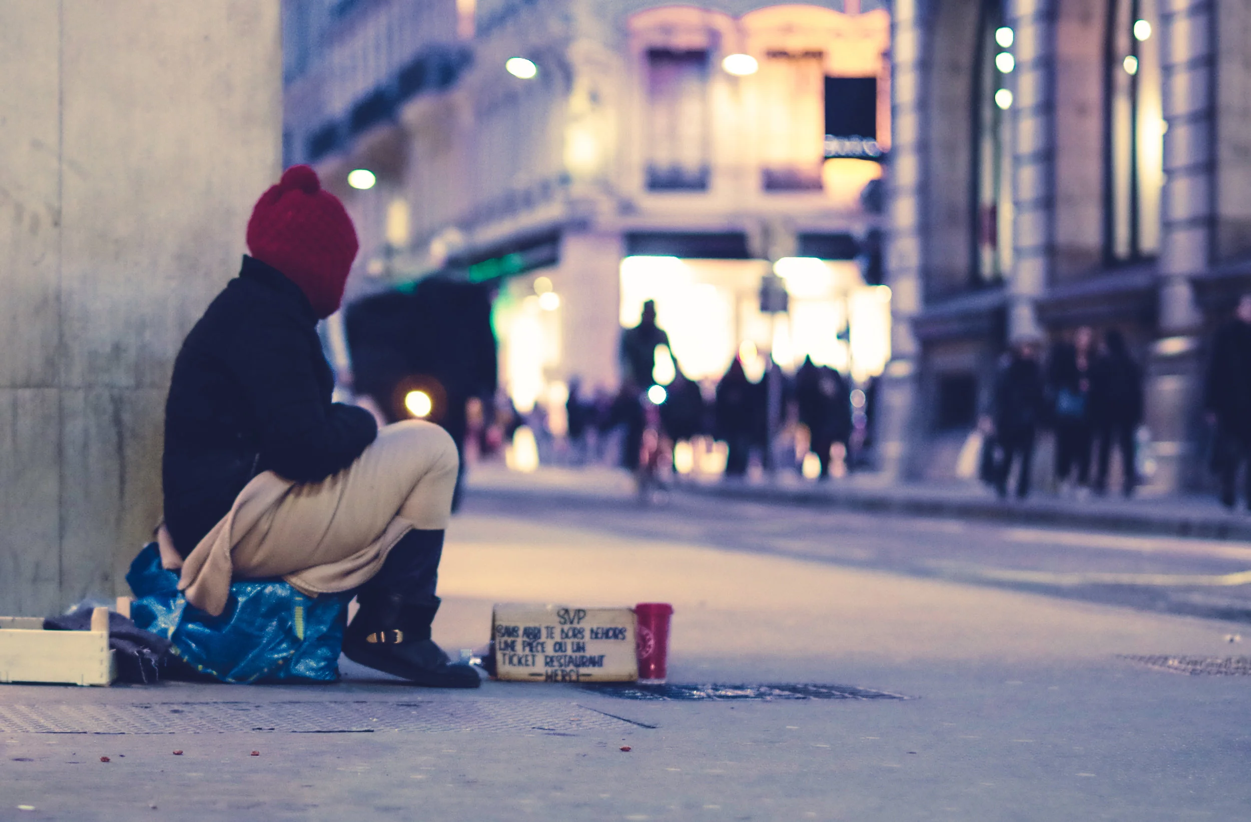
Homelessness in New York City has reached the highest levels since the Great Depression of the 1930s. Each night thousands of unsheltered homeless people sleep on New York City streets, in the subway system, and other public spaces. There is no accurate measurement of New York City’s unsheltered homeless population, and recent City surveys significantly underestimate the number of vulnerable homeless New Yorkers. While there are shelters and people donate money on the street, there are plenty of basic needs that homeless people are still missing.
Concept research
Solution needs to be mobile
Americans spent almost $400 billion online in 2016, and nearly half of that happened on a mobile device. According to the Online Fundraising Scorecard from Dunham+Company, 84% of nonprofits didn’t optimize their donation experience for a smartphone or tablet.
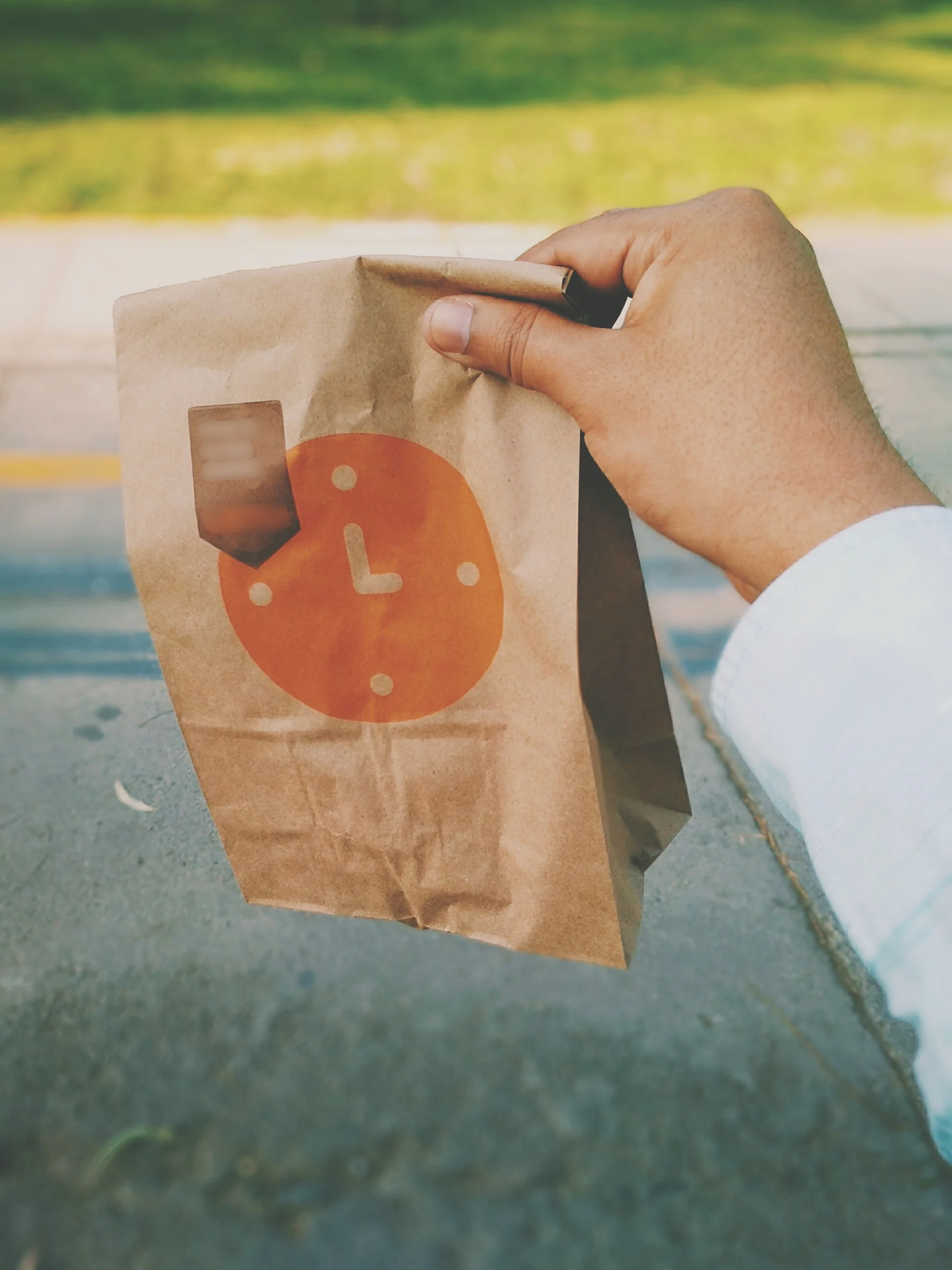
Items to donate.
The data pointed to hygiene items mostly and more basic food items, mostly shelf stable. We can offer them via different groupings and different price points. The prepared kits will cut down on decisions and items can be ready to deliver at a moments notice. Also a general donation should be available as well.
And don’t forget…
Make it simple.
What do you prefer to donate?
#1 reason for giving money was convenience
User Research - Buyers
We needed to understand the process of someone donating to a homeless person in need. We needed to understand the motivation, pain points, and comfort levels of users.
Do you prefer to give money or food/goods to someone in need? Have you ever gone to the store to purchase something specific that someone asked for? Why?
Yesenia: I prefer to give food/goods. I have purchased food for a family in need after they asked for help as I walked past them. I asked if they would like something to eat and when they said yes, I came back with some food.
Does donating to a homeless person or panhandler make you feel anxious or uncomfortable? Is there a way to ease that discomfort/anxiety?
Cecile: yes it does. I wish I were a better person, but it feels like an infringement of my personal space. Also, I know it's a horrible stigma, but not knowing what they'll use the money for is a huge deterrent. That's why it's easier for me to donate to people I've seen around my neighborhood. I get a better sense of who they are and want to help them. Possibly a profile or backstory on the person would do a lot to humanize them.
User Research - RECEIVERS
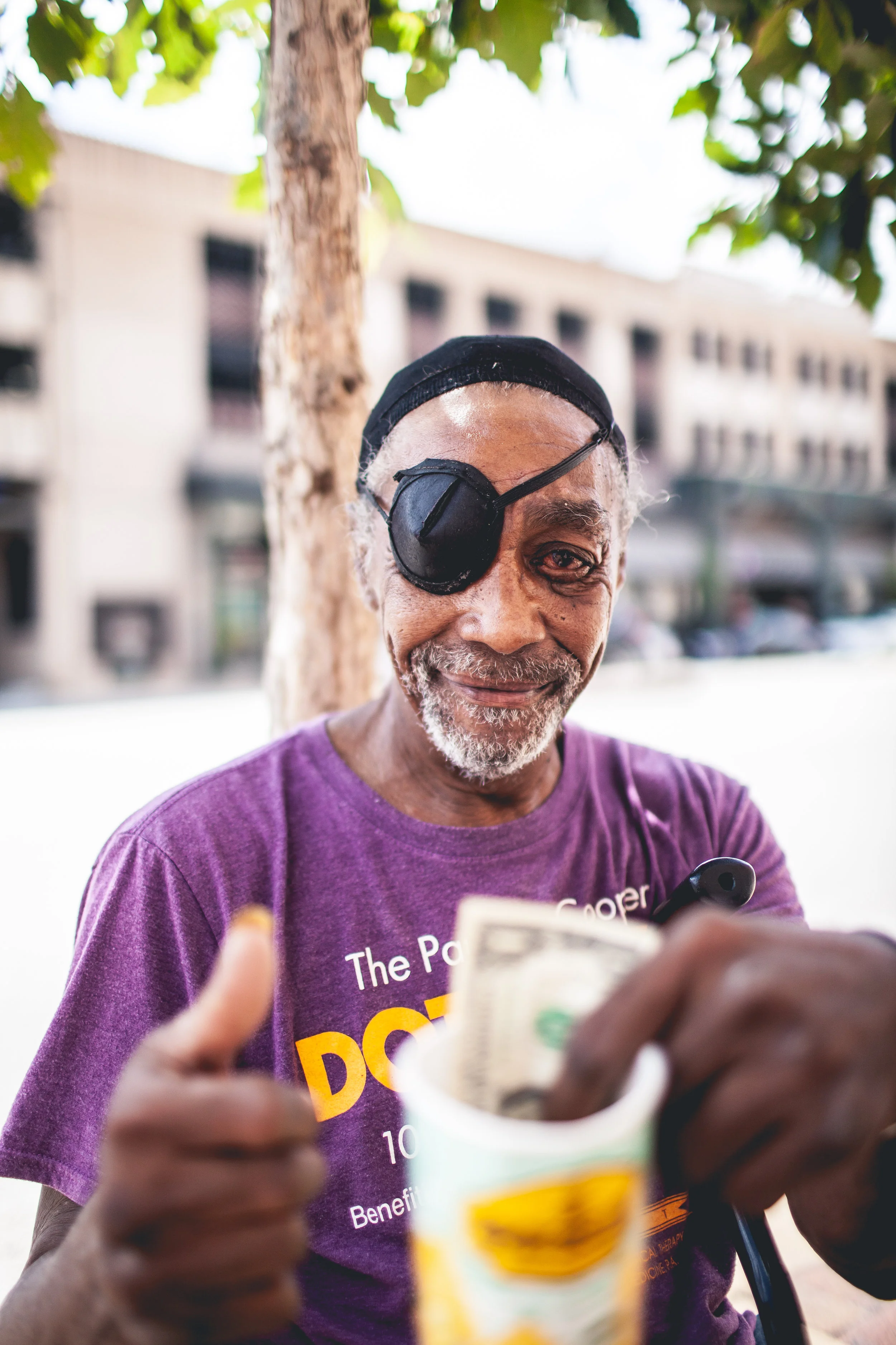
There are also the end recipients to consider. We had to be sure that the goods and service that this app would provide to the homeless population would be received positively.

I spoke to three men near Time Square, each of them I gave a small travel kit, along with a bottle of water and a KIND bar.
Greg: Water is great, backpacks or those cloth shopping bags
Sam: Someone gave me a toothbrush once, that was nice. I’d love one of those phone battery packs. (he waved an old iPhone at me)
Mike: Aside from money, band-aids could come in handy. I get blisters really bad
John, I found near the Staten Island Ferry, he was very friendly and soft-spoken.
John: Honestly anything you can give would be great. (He was sleeping on cardboard boxes so I offered one of those travel pillows and he like that idea a lot. I ran into Duane Reade and got him one)
Sample User Journey
DEREK
“I try to give when I can”
Demographics
Age: 23
Location: Brooklyn
Job: Copywriter/Music Blogger
Salary: $ 40,000/year
Family: Single
Education: BA in English
Technology skills: Computer proficient, PC user, iPhone mobile device
About Derek
New York transplant from Ohio, he’s focused on making friends and having a good time. His priorities are, paying rent, good music, and friends to share it with. Since he moved to NY about 3 years ago, he’s still learning the city and likes to explore. He’s glued to his phone more than he’d like to admit, he is constantly posting to instagram or Snapchat.
Pain Points
Not aware of his surroundings, he often doesn’t notice
homeless people unless they’re in front of him.He needs prompting to donate; it’s not a common task.
Mental Model - Derek - Click to see his full journey
Branding
When considering the branding for this project we looked to our motivation to influence our name. As there are delivery and location elements to the product, we explored words like delivery, local, distribution, and donate. We settled on compassion as it contained the word compass, giving us the location elements we needed.
The logo was created by using two location pins and combining them into a heart shape.
For colors and font, our aim was something gender neutral and approachable.


Prototype - Evolution
Version One
In the first draft, we explored the idea of horizontal and vertical swiping. Allowing users to shop by three categories, premade care kits, kits by cost and individual items, this was in response to some research that suggested it would be easiest to purchase items at a dollar amount.
Our research also showed that some users would want to buy one off items or create a custom care package.
Version Two
With version one prototype, user testing showed two versions of swiping was confusing. Also, the button size was too small for many users and having three categories was not necessary for the user. Feedback from Usertesting.com suggested that we limit the home screen to two groups, kits, and individual items.
Version Three
After another round of user testing, we adjusted the item size going back to our first idea of square icons, which allowed us to fit more items on the page as well. We wanted to include space to promote specific kits, such as seasonal items or if we had sponsors that area will be ad space.
In future versions we would like to explore the options for Force Touch for quick adding to the cart, and recently purchased item prompts as well.